14 December 2009

Historical Typography

If you are interested in illuminated manuscripts and historical typography, Baltimore is a great city to live in. One of the finest collections of illuminated manuscripts in the world, including an extensive collection of Islamic manuscripts, is at the Walters Art Gallery in Mt. Vernon.

The Walters displays a rotating selection from the manuscript collection in the museum, and they have many page samples online. They are also in the process of creating digital surrogates of the Islamic collection and publishing them under a creative commons license on Issuu. The digital surrogates are Flash-based books which can be viewed cover to cover. I've always loved the manuscript collection at the Walters, and it's wonderful that they are in the forefront of using digital technology to make the collection more accessible.

Here are a few samples from the collection:


Rochester Bible
Artist: Anonymous (English)
Date (Period): 1130-1140 (Medieval)
Medium: parchment
Measurements: 14 9/16 x 10 13/16 in. (37 x 27.4 cm)


Claricia Psalter
Artist: Anonymous (German)
Date (Period): late 12th century (Medieval)
Medium: parchment
Measurements: 9 x 6 in. (22.9 x 15.2 cm)


Breviary
Artist: Benedetto Bordon (Italian, 1450-1530)
Date (Period): ca. 1480 (Renaissance)
Medium: parchment
Measurements: folio: 8 7/8 x 6 5/16 in. (22.5 x 16 cm)


Book on Logic (screen shot of the digital surrogate on Issuu)
Author: Muhammad ibn Pir Ahmad al-shahir bi-Ibn Arghun al-Shirazi (early 16th century)
Scribe: Muhammad ibn Pir Ahmad al-shahir bi-Ibn Arghun al-Shirazi (early 16th century)
Date (Period): 1512 (Ottoman)
Medium: ink, paint and gold on paper covered with olive green morocco with paint and gilt
Measurements: Folio H: 7 1/16 x W: 4 1/2 in. (18 x 11.5 cm)


Page samples are on view in the Manuscript and Rare Book area of the Walters website: http://art.thewalters.org/viewgallery.aspx?id=1255

The digitized Islamic manuscripts are published on Issuu in the Medieval Manuscripts group: http://issuu.com/groups/medievalmanuscripts

Also:
The Walters Art Museum Illuminated Manuscripts photostream on flickr: http://www.flickr.com/photos/medmss/

Eureka! Medieval Manuscripts Revealed on the Web (blog): http://digitalarchimedes.ning.com/

Type in the Scuplture of Gyöngy Laky

Type in Art isn't really one of our categories, but it's something I wanted to visit nevertheless. A favorite sculptor of mine, Gyöngy Laky, has worked with type in interesting ways over the years.

Ms. Laky was born in Budapest, Hungary and was a fiber art professor at UC Davis for many years. Her most recent works are primarily constructed from orchard debris which is usually discarded and incinerated. The pieces explore our relationship to and attitudes about our environment. Among her numerous awards, she was awarded a Citation for Typographic Excellence in 2008 by the Type Directors Club.

Her name, incidentally, is pronounced "Jinge (rhymes with hinge) Lock-ee."

THAT WORD
orchard prunnings
8'(h) x 4' x 13', 1989. , (from 14th Biennale Lausanne. 1989)

Q WITH NO A
ash branches, paint, bullets for building
29" x 25" x 2.5". 2007

ALTERATIONS
(commissioned for the cover of the New York Times Magazine)
apple, grapevine, nails, wire
58" x 68" x 3" 2008
ESTUARY
apple, water-based ink, backer-board screws
35" x 34" x 3.5", 2007

GLOBALIZATION IV: COLLATERAL DAMAGE
ash, commercial wood, paint, blue concrete bullets
32"x 97"x 4", 2005


All images from the website of BrownGrotta, an amazing fiber and textile gallery in Connecticut.

10 December 2009

Suburban Typography

Big box stores are a major feature of the suburban landscape. The logotypes for these stores tend to be chunky and sans serif, and the huge signs are easily viewed from the roadway. The typography is uninteresting and functional rather than compelling. I also notice how many stores use extended faces for their logotypes, reinforcing the feeling of largeness.


01 December 2009

The Digital Type Revolution

The digital type revolution is an ongoing process begun in the late 1960s with the invention of the first digital typesetting machines. Characters were generated from mathematical formulas and displayed on a screen; the fonts were stored digitally on magnetic disk drives.

In the early 1980s, Adobe Systems developed PostScript, a device-independent output language. In 1985, Apple Computer licensed PostScript for its first LaserWriter 300dpi desktop printer. In that same year, Aldus introduced PageMaker, the first page layout application, and Adobe introduced PostScript Type 1 fonts. The era of desktop typesetting had arrived.

Previous to Type 1, fonts on desktop computers were fixed-sized bitmaps. A font suitcase would include multiple sizes of the same font (e.g., 10pt, 12pt, 18pt), and the user was limited to those sizes. Type 1 fonts are vector-based outlines, making them infinitely scalable (theoretically). Designers were quick to adopt Type 1 as the preferred type format.

In the late 1980s, Apple and Microsoft developed the TrueType format to compete with Type 1. TrueType fonts include more points for hinting* than Type 1 fonts, so they often render better on screen. This makes them the preferred format for system fonts.

In the 1990s Adobe and Microsoft developed the OpenType font format to address some of the shortcomings of the Type 1 and TrueType formats. In addition to the benefit being cross-platform, OpenType’s Unicode encoding allows for 65,000 characters in a single font (compared to 256 characters for a Type 1 font).

These developments in digital type had a profound impact on the design industry. Designers became their own typesetters, and the typesetting industry largely disappeared. Designers had much more typographic control than previously, but at the same time the tools of the designer were now widely available. Anyone with the tools, but not necessarily the skills, of a designer could produce work that previously had been in the domain of trained graphic designers. Designers as never before found themselves in the position of needing to educate clients and the public about good design, its purpose and it’s value.

Through the early 1990s, the primary focus of graphic design remained the printed piece, and the advancements made in digital type served this focus. This began to change with the introduction of the World Wide Web. For the first time, designers were creating designs whose final form was to be viewed on screen. Designers, used to having a great deal of control over their type, found this was not the case when designing for the web. Web pages had to be viewable across platforms and with various browsers. Designers found they had to limit themselves to using fonts which were likely to be loaded on the viewers computer—namely system fonts such as Arial and Times, and later Verdana and Georgia. To get around this, designers often created images of type and placed the images into their web page designs. This allowed for more typographical control, but at a cost. Inserting type as images increases the size of a website, and thus the bandwidth required to download it; it also can make sites inaccessible to people with disabilities.

Today, we are entering the next phase in the digital type revolution, when %ldquo;real fonts” are becoming available on the web. Though CSS has allowed for website font embedding via @font-face for a number of years, it has been slow to be put into use. There hasn’t been a standard format for web-embedded fonts supported by all of the major browsers, and there has been fear of piracy among type foundries. These concerns are now being addressed. The Web Open Font Format (WOFF) is beginning to be widely embraced, and new type delivery services, such as Typekit, are helping to address issues of hosting and licensing.

The digital type revolution got off to a slow start, but its impact once desktop typesetting was made possible was dramatic. The rise of the web created new opportunities and frustrations for designers, particularly in the area of typography. Today, digital type is poised to undergo another major shift, bringing fine typography to the web. Designers are keen to see how this current phase of the digital type revolution unfolds, and they are curious to discover what new developments will appear on the horizon.

*“At its most basic level hinting (or, more accurately, instructing) a font is a method of defining exactly which pixels are turned on in order to create the best possible character bitmap shape at small sizes and low resolutions.” http://www.microsoft.com/typography/TrueTypeHintingWhat.mspx

Illustrations

Linotype CRTronic 360, one of the first digital typesetting machines. http://en.wikipedia.org/wiki/File:Linotype_CRTronic_360.jpg

Bitmap vs. Outline font. http://www.designhistory.org/Digital_Revolution.html

Website. Home page for the RCI Sound Systems website designed by the author in 1998. A frightening example of a webpage using images for type. Not to mention many nested tables.

Bibliography

Brown, Tim. “Real Web Type in Real Web Context,” A List Apart, November 17, 2009, http://www.alistapart.com/articles/real-web-type-in-real-web-context/

Felici, James. The Complete Manual of Typography. Berkley: Adobe Press, 2003, 3–19.

Lie, Hakon Wium. “CSS @ Ten: The Next Big Thing,” A List Apart, August 28, 2007, http://www.alistapart.com/articles/cssatten

Lupton, Ellen. “Typography on the Web: Questions for Jeffrey Zeldman,” Print Magazine Online. http://www.printmag.com/Article/Questions-for-Jeffrey-Zeldman-Part-1 and http://printmag.com/Article/Questions-for-Jeffrey-Zeldman-Part-2

Microsoft. Microsoft Type Website,http://www.microsoft.com/typography/default.mspx

Pfiffner, Pamela. Inside the Publishing Revolution: The Adobe Story. Berkley: Adobe Press, 2002, 23–29.

Santa Maria, Jason. “On Web Typography,” A List Apart, November 17, 2009. http://www.alistapart.com/articles/on-web-typography/

Stock-Allen, Nancy. “The Computer Era,” http://www.designhistory.org/Digital_Revolution.html

Tam, Keith Chi-hang. “Digital typography: a primer,” http://keithtam.net/writings.html

Zeldman, Jeffrey and Ethan Marcotte. Designing with Web Standards, 3rd ed. Berkley: New Riders, 2009, 265–293.

Wikipedia. “Phototypesetting,” http://en.wikipedia.org/wiki/Phototypesetting

30 November 2009

Typographical Error

A salon in my neighborhood recently changed names. It had been called Caesars Forum, and it is now Salon by Julian. Apparently, the salon owner was concerned that customers wouldn't know it was still the same salon under a different name, so they hung a large banner beneath the new sign:

Strictly speaking, this may not be a typographical error, but a case of someone not knowing the difference between the words “formerly” and “formally.” Either way, I laugh every time I drive by it. Notice also that the sign-maker squished the typeface rather than employing a true condensed face. That's definitely a crime against typography.

23 November 2009

Interesting Type Treatment

I've recently been noticing some interesting print ads for Visa. The adds’ central feature is a large collage spelling out the word “go.” The commissioned collages encorporate everything from origami cranes to recycled computer parts. The approach varies greatly from piece to piece, but the typography always remains constant. It's amazing just how precise the typography is, considering that many of these are physical creations, not computer illustrations. Here are just a few:


See the origamist's Visa Go photostream here.


A great stop-motion video of the making of this sculpture can be seen here.
It took 3 days to make and 30 minutes to shoot!

10 November 2009

Real Fonts on the Web

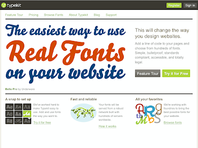
Typekit is a new service that allows you to real fonts on the web. They serve the fonts, you add a little javascript code to your pages, and voilá! In the screenshot below, the headline is type, not a graphic. Check it out!!

Somethin' for nuthin'

Here's a fun display typeface called Hand of God by designer Celeste Prevost. It's available as a free download here.

03 November 2009

Logotypes

I received a junkmail postcard the other day from DirecTV urging me to dump cable for satellite. The fact that I've had DirecTV for a good decade now didn't spare me from this mailing. However, just as I was about to toss the postcard into the recycle bin I noticed all the logotypes for the channels on offer. Here's a sampling of some of the better ones.


I really like this logo for the Science Channel. The reference to the periodic table of elements is clever and clear. From the standpoint of reproducibility this is a great logo: one color, no screens; it will work well large or small; it will work on tv, web, mobile devices, print, t-shirts, mugs, and all manner of ugly trade show tchotkes.


These logotypes for the major movie channels reference camera lenses, spotlights and star filters.


The USA network doesn't have much to work with conceptually, but the logotype is nice. I like the use of positive and negative space to create the S.

13 October 2009

Neon Typography

I thought it would be interesting to look at a cross section of neon typography from one location. The examples below are all from the Can Company in Canton.


This parking sign has a lot of personality for something that seems to have been slapped together to fulfill a basic function. Each syllable runs slightly uphill, having the effect of breaking the sign into two words: PAR KING. I also like that it says RARKING, because the stroke off of the P isn't completely blacked out.


This sign for a tanning salon has a lot going on typographically. “Electric” is all lowercase in an extended typeface that calls to mind wiring or circuitry. “Rays” is upper and lower case in a retro script typeface reminiscent of the Ray Bans logo. Finally, “Tanning Salon” is all caps in a typeface similar to the “electric” typeface, but less extended.


The LensCrafters sign is a simple neon version of their logotype.


Saving the best for last, this is the sign above a side door near the bar area of the Austin Grill. The typeface has a Western feel that communicates the TexMex vibe of the restaurant. The letterforms remind me of rope, and I particularly like the curlicue on the exclamation point.

06 October 2009

Graffiti and Urban Typography

Graffiti and urban typography often coincide and overlap, so I wanted to look at both together. All of the photos in this post are by Hrag Vartanian. Hrag is an art critic and writer in Brooklyn, and he's made his extensive Flikrstreams (4000+ images) available for use free of charge under a Creative Commons 2.0 license.


This first image is straightforward graffiti. I love the symmetry of the mirror image 5 and 2.


I'm fairly sure this is type, but it's so stylized it's hard to decipher. This reminds me of the kinds of stylized type my friends and I would develop in middle school for note-writing. Type designed to be undecipherable to the uninitiated. That is, adults.


Here, graffiti and urban typography come together. The stenciled “built for collapse” on the right could be a political statement or simple FYI statement. I like the ambiguity.


This one's definitely a political statement. Urban typography as street art.


Spray paint is generally the medium of graffiti. Here it appears to have been used with a stencil to create the crisp letterforms and gun graphic. Street art? Graffiti? Both? Definitely urban typography.


I'm including this last image, because I respond to it as type; I keep trying to read it. The form in the center left could be an L. The center right seems to say “eve.” Again, I find the ambiguity appealing.

29 September 2009

Business Typography

Some interesting “business” typography has been landing in my inbox lately. The viagra/cialis spammers' ever evolving efforts to get past spam filters has lead to these gridded type treatments. Above, the letterforms are straightforward, and, to humans, the words are readable. However, to a spam filter searching for keywords, this just says VGCCLIRHAiiAAEPAS. Below, color blocks are used to create the letterforms, which to a spam filter aren't letters at all.

Fortunately, my spam filter learns quickly, so these messages are now routed directly to my spam folder. Though I kind of like the bitmap typeface below.


Update: I just found another one in my spam folder. A geometric “cialis” cobbled together with the “cheap” from above. Not much thought given to the aesthetics of type here!

24 September 2009

The Typography of the Corner Tavern

When considering local flavor typography, my mind immediately turned to that Baltimore fixture, the corner tavern. I took a walk around the block to see what I could see, typography-wise.


At the north end of my block is Salt. Salt is a contemporary take on the corner tavern, featuring new American cuisine. This contemporary outlook is reflected in the design of the whole tavern, including the signage. The lowercase sans-serif letters are mounted slightly off the face of the wall, using light and shadow to created added dimensionality; A horizontal line in the brickwork provides a convenient baseline.


At the south end of my block is Butts & Betty's Tavern. This sign hangs over the corner entrance to the tavern. The typography seems haphazard, pairing a slab-serif with an italic sans-serif. It's a straightforward sign without a lot of thought given to aesthetics.


Across the street from Butts & Betty's is Brewster's Tavern. This tavern changed hands not too long ago, and this is a fairly new sign. The swash on the B echoes the curved form of the rooster's tail. The coloring-in of some of the counters adds a whimsical quality to the letterforms.


Finally, one block west of Butt's & Betty's and Brewster's is Mary's Tavern. This is a very small neighborhood tavern, run out of the front parlor of a private home. The sign appears to be homemade using plastic letters from a hardware store. It's purpose would seem to be purely functional, perhaps to meet legal requirements for signage for a place of business.

23 September 2009

Typography Artist Talk


Local typography rock stars, Bruce Willen and Nolen Strals of Post Typography, will be giving an artist talk at UMBC on Thursday, October 8, 2009 at 7:00pm. They will be discussing their work as featured in the UMBC exhibition The Art of Persuasion: Poster Design from 1896 through 2008, and also signing their new book, Lettering & Type: Creating Letters and Designing Typefaces.

22 September 2009

Hand-Painted Typography

Lemonade Sign


The Baltimore Farmers Market is a fantastic place to see hand-drawn and -painted typography. Everything from professionally painted trucks to magic marker on cardboard. Farmers market regulars may have noticed this hand-painted lemonade sign at the Best Fish on Planet Earth booth. If you ever find yourself waiting in line for coffee at Zeke's it'll be right behind you. I love that the sign itself is lemon-shaped, and also that it's clearly seen better days. Here are a few other great examples.


This Falafel booth sign is a great way to make a large sign out of small materials. Easy to pack up and transport.

Falafel Sign

Even on simple price signs there is often interesting hand-lettering.


The type's not so interesting here, but the pumpkins are cute.


I can't have a Baltimore Farmers Market post without including the crab truck.