 Strictly speaking, this may not be a typographical error, but a case of someone not knowing the difference between the words “formerly” and “formally.” Either way, I laugh every time I drive by it. Notice also that the sign-maker squished the typeface rather than employing a true condensed face. That's definitely a crime against typography.
30 November 2009
Typographical Error
A salon in my neighborhood recently changed names. It had been called Caesars Forum, and it is now Salon by Julian. Apparently, the salon owner was concerned that customers wouldn't know it was still the same salon under a different name, so they hung a large banner beneath the new sign:
 Strictly speaking, this may not be a typographical error, but a case of someone not knowing the difference between the words “formerly” and “formally.” Either way, I laugh every time I drive by it. Notice also that the sign-maker squished the typeface rather than employing a true condensed face. That's definitely a crime against typography.
Strictly speaking, this may not be a typographical error, but a case of someone not knowing the difference between the words “formerly” and “formally.” Either way, I laugh every time I drive by it. Notice also that the sign-maker squished the typeface rather than employing a true condensed face. That's definitely a crime against typography.
23 November 2009
Interesting Type Treatment
I've recently been noticing some interesting print ads for Visa. The adds’ central feature is a large collage spelling out the word “go.” The commissioned collages encorporate everything from origami cranes to recycled computer parts. The approach varies greatly from piece to piece, but the typography always remains constant. It's amazing just how precise the typography is, considering that many of these are physical creations, not computer illustrations. Here are just a few:


See the origamist's Visa Go photostream here.

A great stop-motion video of the making of this sculpture can be seen here.
It took 3 days to make and 30 minutes to shoot!
It took 3 days to make and 30 minutes to shoot!
10 November 2009
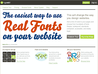
Real Fonts on the Web
Typekit is a new service that allows you to real fonts on the web. They serve the fonts, you add a little javascript code to your pages, and voilá! In the screenshot below, the headline is type, not a graphic. Check it out!!

Somethin' for nuthin'
Here's a fun display typeface called Hand of God by designer Celeste Prevost. It's available as a free download here.


03 November 2009
Logotypes
I received a junkmail postcard the other day from DirecTV urging me to dump cable for satellite. The fact that I've had DirecTV for a good decade now didn't spare me from this mailing. However, just as I was about to toss the postcard into the recycle bin I noticed all the logotypes for the channels on offer. Here's a sampling of some of the better ones.
 I really like this logo for the Science Channel. The reference to the periodic table of elements is clever and clear. From the standpoint of reproducibility this is a great logo: one color, no screens; it will work well large or small; it will work on tv, web, mobile devices, print, t-shirts, mugs, and all manner of ugly trade show tchotkes.
 These logotypes for the major movie channels reference camera lenses, spotlights and star filters.
 The USA network doesn't have much to work with conceptually, but the logotype is nice. I like the use of positive and negative space to create the S.
Subscribe to:
Posts (Atom)
